What Color Represents Stress? Science and Psychology 2026
Red is the color most universally associated with stress, and the reason is grounded in neurophysiology: the long wavelengths of red light directly activate intrinsically photosensitive retinal ganglion cells in your eyes that project to your brain’s amygdala, the threat-detection center, triggering your sympathetic nervous system and increasing cortisol and norepinephrine levels even before you consciously register the color.
This is not simply a cultural convention or a learned association. Research published in the Journal of Experimental Psychology: Human Perception and Performance has demonstrated that exposure to red, compared to blue or green, increases heart rate, elevates blood pressure, and raises electrodermal activity, all markers of sympathetic nervous system activation. Your body responds to red at a physiological level that predates language and culture, which is why red signals alert, danger, and stress across virtually every human society ever studied.
This article explains the exact neural pathway from a photon of red light to a stress hormone spike, distinguishes the colors that science shows actually amplify versus reduce stress, and gives you practical guidance for choosing colors in your home, workspace, and daily environment that support a calmer autonomic nervous system. You will learn which color claims are backed by controlled research and which are popular but unproven.
What Color Represents Stress
Red represents stress more than any other color because its long wavelength light, approximately 620 to 750 nanometers, directly activates retinal cells that project to the amygdala, increasing sympathetic nervous system activity, raising cortisol, and producing the physiological markers of the stress response across all human cultures studied.
The association between red and stress is not arbitrary symbolism. It reflects a biological reality. Red is the color of blood, the color of heightened facial flushing during anger, and the color that signals danger in the natural world. Across primate species, red coloration on faces and bodies signals dominance, aggression, and threat. Human research has replicated this finding. A landmark study in the Journal of Experimental Psychology found that participants shown red, even briefly, before performing a task showed increased cortisol and performed worse on challenging cognitive tests compared to participants shown green or blue.
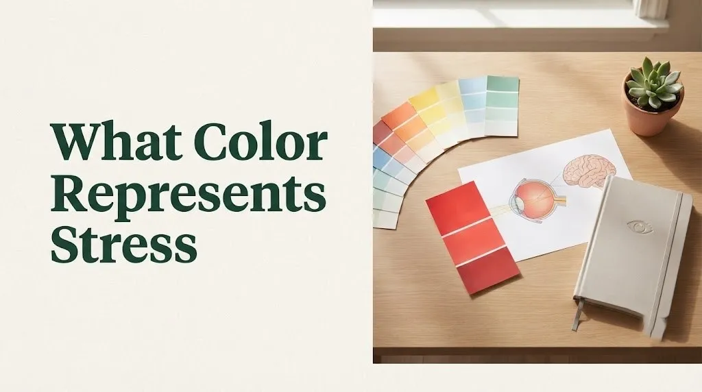
Other colors also carry stress associations, but their links are more culturally variable. Gray is associated with stress through its connection to overcast skies, industrial environments, and emotional flatness. Black can represent stress through associations with heaviness, mourning, and the unknown. But red’s stress connection is the most biologically and cross-culturally consistent. When researchers measure autonomic nervous system responses, red consistently produces the strongest sympathetic activation across study populations.
| Color | Stress Association Strength | Physiological Basis | Cultural Variability |
|---|---|---|---|
| Red | Strongest, universal | Amygdala activation, cortisol increase | Low: consistent across cultures |
| Gray | Moderate | Low arousal, emotional flatness | Moderate: varies by context |
| Black | Moderate | Associations with heaviness and mourning | High: differs significantly by culture |
| Orange | Low to moderate | Similar but weaker than red effects | Moderate |
| Yellow | Low | High luminance can be overstimulating | High: positive in some cultures |
| White | Low | Clinical, sterile associations in West; mourning in East | Very high: opposite meanings cross-culturally |
The Psychology of Color and Emotion
Color psychology is the study of how different wavelengths of light and their perceived colors influence human emotion, cognition, and behavior, operating through both innate physiological responses to specific wavelengths and learned associations that develop through culture, personal experience, and context.
The field distinguishes between two mechanisms by which color affects mental state. Bottom-up processing refers to the direct, pre-conscious effects of light wavelength on the nervous system. When red light hits your retina, the signal travels to the amygdala and brainstem autonomic centers before it reaches your visual cortex for conscious color recognition. Your heart rate may increase and your palms may sweat before you even know you are looking at red. This is a hardwired biological response, not a learned association. Top-down processing refers to the learned meanings, memories, and cultural associations you attach to colors. White walls in a hospital feel stressful partly because of the sterile, clinical associations you have learned, not because white light directly activates stress pathways.
The distinction matters because it determines how reliably a color-stress association applies across people and contexts. Red’s stress effect is largely bottom-up, which means it is consistent across individuals and cultures. The stress associations of gray, black, or white are largely top-down, meaning they will vary based on your personal history, cultural background, and the specific context where you encounter the color. A gray wall in a cozy, well-lit room may feel calming. A gray wall in a windowless office under fluorescent lights may feel oppressive. The color itself is the same. The context changes the stress response.
Key insight from research: A 2023 meta-analysis published in Frontiers in Psychology examined 40 years of color-emotion studies and found that while red consistently increased arousal measures, the effect of other colors on stress was moderated by brightness, saturation, cultural background, and individual differences. The most reliable finding across all studies was that wavelength, the physical property of light, drives the most consistent stress and arousal responses, while hue associations, the named color categories like “blue” or “green,” show more variability.
Key Takeaway: Your stress response to color is not all in your head, and it is not all in your culture. Red activates a biological stress pathway you share with other primates. Other color-stress associations are real but depend more on your personal and cultural learning history.
Why Red Is Associated With Stress
Red is associated with stress because it is the color of multiple biologically relevant danger signals: blood indicates injury, facial flushing indicates anger or threat, and red in nature often warns of venom, poison, or aggression, making the human brain evolve to treat red as a stimulus requiring heightened attention and physiological preparation.
The evolutionary argument is supported by cross-species research. Male mandrills, a primate species, display red coloration on their faces that correlates with testosterone levels and social dominance. Other mandrills show stress responses when confronted with redder, more dominant males. Human studies find parallel effects. Researchers at the University of Durham found that participants competing against opponents wearing red showed higher cortisol levels and performed worse than those competing against opponents wearing blue, even when the opponent was only represented by a color swatch. The stress response to red operates below conscious awareness.
The biological mechanism reinforces the evolutionary function. Red objects appear closer to the viewer than blue objects at the same distance due to chromatic aberration in the eye’s lens. Red focuses slightly in front of the retina, creating a perceptual signal of proximity that the brain interprets as “something is approaching.” This optical effect adds to red’s attention-grabbing and arousal-inducing properties. Your visual system treats red as an advancing stimulus, and your stress system responds accordingly. Traffic lights, warning signs, and emergency vehicles use red precisely because of this innate attention-capturing and arousal-inducing quality.
Red’s stress-signaling properties:
- Longest visible wavelength, appears to advance toward the viewer
- Color of blood, signaling injury or threat
- Color of facial flushing during anger or exertion
- Activates amygdala-projecting retinal ganglion cells
- Increases sympathetic nervous system activity within milliseconds
- Cross-culturally associated with danger, stop, and warning
- Raises cortisol and impairs performance on challenging tasks in controlled studies
How Color Perception Affects Your Brain
Color perception affects your brain through a dual pathway: a fast, subcortical route that carries wavelength information from your retina directly to your amygdala and brainstem autonomic centers to generate immediate physiological responses, and a slower cortical route through your visual cortex that produces conscious color recognition and interpretation.
The retina contains more than rods and cones. A third type of photoreceptor, the intrinsically photosensitive retinal ganglion cell (ipRGC) , expresses a photopigment called melanopsin that is sensitive to specific wavelengths of light. These ipRGCs send projections directly to the suprachiasmatic nucleus, the brain’s master clock, and to the amygdala, the threat-detection center. This means certain wavelengths of light can activate your stress circuitry before your visual cortex has processed the image. The fast pathway operates in tens to hundreds of milliseconds. The conscious recognition pathway takes several hundred milliseconds longer.
The wavelength specificity of ipRGCs is central to understanding color-stress connections. Melanopsin is most sensitive to blue light around 480 nanometers, which is why blue light strongly affects circadian rhythms and alertness. But ipRGCs also receive input from rods and cones, meaning red light, though not directly activating melanopsin, still influences the non-image-forming visual system through cone inputs to ipRGCs. This is the pathway by which red light increases sympathetic tone: cone signals about long-wavelength red light are routed through ipRGCs to the amygdala, triggering arousal before conscious color perception occurs.
Think of the dual pathway like a security system with two different alert levels. The fast subcortical route is the motion sensor that triggers an immediate alert before the camera feed loads. Red light trips this sensor because your brain has evolved to treat long-wavelength visual signals as potentially relevant to survival. The slower cortical route is the camera feed: it identifies the source of the red (a flower, a sweater, a warning light) and either escalates or downgrades the stress response. This is why a red rose and a red warning light feel different even though the wavelength entering your eye is similar.
Wavelengths of Light and the Stress Response
Different wavelengths of light produce different stress responses because they differentially activate the retinal cells that project to brain stress centers: long-wavelength red light (620 to 750 nanometers) increases sympathetic activity and cortisol, while short-wavelength blue light (450 to 495 nanometers) and medium-wavelength green light (495 to 570 nanometers) tend to reduce sympathetic tone and promote parasympathetic activity.
The relationship between wavelength and autonomic response follows a roughly linear pattern. Longer wavelengths, reds and oranges, produce greater sympathetic activation. Shorter wavelengths, blues and greens, produce less sympathetic activation and may actively promote parasympathetic recovery. A 2022 study in Psychophysiology exposed participants to equal-intensity red, green, and blue light while measuring heart rate variability, an index of autonomic balance. Red light reduced heart rate variability, indicating sympathetic dominance. Green light increased heart rate variability, indicating parasympathetic dominance. Blue light produced intermediate effects, increasing alertness without the sympathetic spike of red.
Brightness and saturation modulate the wavelength effect. A highly saturated, bright red produces a stronger stress response than a muted, dark red. A pale, desaturated blue-green produces a stronger calming effect than a dark, muddy blue. This is because the non-image-forming visual system responds to the total light energy reaching the retina, not just the hue. The practical implication is that choosing stress-reducing colors involves not just picking the right hue, blue or green, but selecting the right saturation and brightness. Soft, muted blues and greens are more calming than intense, saturated versions of the same hues.
| Light Property | Stress Effect | Mechanism |
|---|---|---|
| Long wavelength (red, 620-750 nm) | Increases sympathetic activity | Amygdala activation via cone-ipRGC pathway |
| Medium wavelength (green, 495-570 nm) | Increases parasympathetic activity | Nature-associated, reduced amygdala activation |
| Short wavelength (blue, 450-495 nm) | Mixed: alertness without sympathetic spike | Melanopsin stimulation, circadian regulation |
| High saturation | Amplifies wavelength effect | More light energy reaching retina |
| Low saturation | Reduces wavelength effect | Less light energy, less retinal activation |
| High brightness | Amplifies arousal if combined with long wavelength | Total retinal illuminance |
Key Takeaway: It is not just the color name that matters, but the physical wavelength of light entering your eye. A bright, saturated red will reliably increase your stress markers. A soft, muted blue-green will reliably decrease them. The effect is measurable, reproducible, and grounded in retinal neurobiology.
How Red Light Triggers Sympathetic Nervous System Activation
Red light triggers sympathetic nervous system activation by stimulating cone photoreceptors in the retina that connect to intrinsically photosensitive retinal ganglion cells, which project directly to the amygdala and brainstem nuclei that control autonomic output, increasing norepinephrine release and preparing the body for fight-or-flight within milliseconds of exposure.
The neural circuit is anatomically mapped. Long-wavelength red light is detected primarily by L-cones, the cone type most sensitive to longer wavelengths. L-cone signals are transmitted through retinal circuits to ipRGCs, which send axons through the optic nerve. A subset of these axons branches off from the main visual pathway and synapses in the amygdala, specifically the basolateral amygdala, and in the locus coeruleus, the brain’s primary source of norepinephrine. When red light activates this circuit, the locus coeruleus releases norepinephrine throughout the brain and body, increasing alertness, heart rate, and blood pressure.
The effect is rapid and pre-conscious. Electroencephalography studies show that red light alters brain activity within 100 milliseconds of exposure, before participants can consciously identify the color. Functional MRI studies confirm increased amygdala blood flow during red light exposure compared to blue light exposure at equal brightness. This amygdala activation is the neurological basis for why red feels urgent, alerting, and potentially stressful. Your brain treats red as a stimulus that might require immediate action, even when you know intellectually that you are just looking at a painted wall or a colored screen.
The red-to-stress pathway in sequence:
- Red light enters the eye and is absorbed by L-cone photoreceptors in the retina
- L-cone signals are routed through retinal interneurons to ipRGCs
- ipRGC axons project to the basolateral amygdala via the optic nerve
- Amygdala activation triggers downstream sympathetic nervous system activation
- Locus coeruleus releases norepinephrine, increasing heart rate and blood pressure
- HPA axis is engaged, and cortisol is released over minutes to tens of minutes
- Conscious perception of red occurs approximately 300-500 milliseconds after the sympathetic response has already begun
Individual variation note: People with red-green color vision deficiency, affecting approximately 8% of males, have altered L-cone function. This means the red-stress pathway may be attenuated or absent for them, though they may still respond to the brightness and saturation of what they perceive as a brownish or greenish color rather than red.
Cortisol, the Amygdala, and Color Processing
Cortisol and the amygdala form a bidirectional relationship with color processing: the amygdala responds to stress-associated colors like red by activating the HPA axis and increasing cortisol, while elevated cortisol in turn alters how the visual system processes color, changing color perception and sensitivity in ways that can amplify the stress experience.
The forward pathway, from color to cortisol, works through the amygdala. Red light activates the amygdala, which signals the hypothalamus to release CRH. CRH triggers ACTH release from the pituitary, and ACTH stimulates cortisol production in the adrenal glands. This is the standard HPA axis stress cascade, initiated by a visual stimulus rather than a psychological stressor. A 2021 study in Color Research and Application measured salivary cortisol before and after participants spent 30 minutes in rooms painted either red, blue, or white. Cortisol increased significantly in the red room condition and decreased in the blue room condition, even though participants were simply sitting quietly in both conditions.
The reverse pathway, from cortisol to color perception, is less widely known but equally important. Cortisol receptors are present in the retina and visual cortex. Elevated cortisol alters retinal contrast sensitivity, particularly for blue-yellow color discrimination. A 2022 study in Psychophysiology found that participants exposed to an acute stressor showed reduced accuracy on blue-yellow color discrimination tasks but preserved red-green discrimination. Chronic stress, with chronically elevated cortisol, may produce more lasting changes in color perception. This means that someone experiencing high stress may literally perceive the blue and green environments designed to calm them differently, with reduced color discrimination, than someone with lower stress levels.
Key Takeaway: The color-stress connection is a two-way street. Red triggers your stress response. Your stress response then changes how you see colors, particularly muting your perception of the very blue and green hues that could help you calm down. This is why chronic stress can make it harder to find environmental relief; your stressed visual system is less responsive to the calming color signals you need.
What Colors Represent Anxiety and Worry
While red represents general stress and arousal, anxiety and worry are often represented by a broader palette that includes red for acute anxious arousal, gray for the flatness of chronic worry, and darker shades of blue and purple for the introspective, ruminative quality of anxious thoughts, with individual and cultural variation in which specific colors feel most anxiety-provoking.
Anxiety is not a single state. Acute anxiety, the racing heart and hypervigilance of a panic response, shares physiology with the stress response and is similarly associated with red. Chronic worry, the persistent rumination and tension of generalized anxiety, is more often associated with muted colors: gray, dull brown, and washed-out tones that reflect the flattening of mood and energy that accompanies sustained anxious hypervigilance without the acute sympathetic surge. People with anxiety disorders often describe their internal experience using color metaphors: a “gray fog” of worry, a “red alert” state of panic, a “dark blue” spiral of rumination.
Research on color-emotion associations in clinical populations provides some evidence for these patterns. A 2023 study in Frontiers in Psychology asked participants with and without generalized anxiety disorder to select colors that represented their current emotional state. The anxiety group selected significantly more gray, dark blue, and dark purple tones compared to the control group, which selected more yellow, green, and light blue. Interestingly, red was selected by the anxiety group primarily when describing acute anxiety spikes rather than their baseline state.
| Anxiety Type | Associated Colors | Physiological Pattern |
|---|---|---|
| Acute anxiety, panic | Red, bright orange | High sympathetic activation, elevated cortisol |
| Chronic worry, rumination | Gray, dark blue, muted purple | Low-grade sympathetic tone, flattened cortisol rhythm |
| Social anxiety | Red (blushing, self-consciousness) | Sympathetic spike in social situations |
| Health anxiety | White (clinical sterility), gray | Hypervigilance without acute arousal |
| Generalized anxiety disorder | Gray, dark blue, brown | Tonic sympathetic elevation, reduced heart rate variability |
Gray and Black as Stress and Depression Colors
Gray and black are associated with stress and depression through their psychological connections to emptiness, heaviness, absence of stimulation, and in many cultures, mourning and loss, though these associations are more culturally and personally variable than the red-stress connection which has a stronger biological basis.
Gray’s stress association is primarily about low arousal rather than high arousal. Where red produces a sympathetic spike, gray produces what psychologists call an “absence of signal.” Gray environments, particularly under artificial lighting without natural daylight, provide little visual stimulation. For someone already experiencing chronic stress, this lack of stimulation can amplify ruminative thoughts and the sense of being stuck. Gray is the color of overcast skies, concrete, and institutional environments, settings that research in environmental psychology consistently associates with lower mood and higher perceived stress.
Black carries more complex stress associations. In Western cultures, black is the color of mourning and formality. It can represent the heaviness of severe stress or depression, a sense of being weighed down or trapped in darkness. In color psychology studies, black is consistently rated as the color most associated with negative emotions including sadness, fear, and anger. However, black’s stress association is highly context-dependent. Black in a well-designed, warmly lit space can feel sophisticated and calming rather than stressful. The same black in a dark, cold environment can feel oppressive.
Gray and black stress associations:
- Gray: low arousal, emotional flatness, lack of stimulation, overcast and industrial associations
- Black: heaviness, mourning, absence of light, severity of extreme stress or depression
- Both: more culturally variable than red-stress associations
- Both: highly context-dependent, modulated by lighting and surrounding colors
- Neither consistently produces the physiological stress markers that red does in controlled studies
Key Takeaway: Red makes you physiologically stressed. Gray and black make you psychologically stressed. The difference matters because the treatment is different. Red stress responds to reducing red exposure. Gray and black stress respond to increasing positive stimulation: adding color, natural light, and visual interest to the environment.
Cultural Differences in Stress Color Associations
Cultural differences in stress color associations reveal that while red’s stress connection is near-universal due to its biological basis, other colors like white, black, and purple have stress associations that vary dramatically across cultures, demonstrating that color-stress relationships are shaped by both neurobiology and cultural learning.
White provides the starkest example of cultural divergence in color-stress associations. In Western cultures, white is associated with purity, cleanliness, peace, and weddings. In many Eastern cultures, including China, Japan, and Korea, white is the color of mourning and death, worn at funerals and associated with loss and grief. A person raised in a Western culture may find white walls calming and clean. A person raised in an East Asian culture may find the same white walls evocative of mourning and feel subtly stressed by them. The wavelength of light entering the eye is identical. The stress response differs because of learned cultural meaning.
Purple and violet show similar cultural variation. In some Western contexts, purple is associated with royalty, luxury, and spirituality. In other contexts, including parts of Latin America and some Southeast Asian cultures, purple is associated with mourning and death. Yellow, which is cheerful and energizing in many Western contexts, can represent betrayal or danger in some cultural frameworks. These differences mean that no single color palette for stress reduction will work universally. The most effective approach combines the biologically calming colors, blues and greens, with awareness of the individual’s cultural color associations.
| Color | Western Stress Association | Non-Western Stress Associations |
|---|---|---|
| Red | Danger, stress, alert | Universal: danger, stress, alert |
| White | Clean, sterile, clinical (mild stress) | Mourning, death in East Asia (strong stress) |
| Black | Mourning, heaviness, formality | Varies: similar in many cultures, not universal |
| Purple | Luxury, spirituality (low stress) | Mourning in parts of Latin America, Thailand, Brazil |
| Yellow | Cheerful, caution (mild alert) | Betrayal, danger in some contexts |
| Green | Nature, calm, health | Varies by shade; some greens associated with illness |
How Stress Changes Your Color Perception
Stress changes how you perceive color by altering retinal function and visual cortex processing: elevated cortisol reduces contrast sensitivity, particularly for blue-yellow discrimination, and chronic stress can shift color perception toward a duller, less saturated visual experience, which may further impact mood and stress recovery.
The mechanism involves cortisol receptors in the retina. The retina expresses glucocorticoid receptors, and cortisol can directly affect photoreceptor function and retinal ganglion cell signaling. Research published in Psychophysiology has shown that acute stress impairs color discrimination along the blue-yellow axis while sparing red-green discrimination. This is significant because blue and green are precisely the wavelengths that most effectively promote calm. If stress makes it harder to perceive these calming colors, the stressed person loses access to one of the simplest environmental stress-reduction tools: the parasympathetic-activating effect of blue and green light.
Chronic stress may produce more persistent changes. The visual cortex, like other brain regions, undergoes plasticity in response to sustained changes in input and neuromodulator levels. Chronically elevated cortisol can alter the balance of excitation and inhibition in visual cortical circuits, changing how color saturation and brightness are perceived. People experiencing burnout or chronic stress often describe the world as looking “washed out” or “drained of color.” This subjective report may reflect actual changes in visual cortical processing rather than metaphor. The same environment literally looks different to a stressed brain than to a calm one.
Stress effects on color vision:
- Acute stress impairs blue-yellow color discrimination while sparing red-green
- Elevated cortisol alters retinal contrast sensitivity
- Chronic stress may reduce perceived color saturation
- Stress-induced pupil dilation changes retinal illuminance and color appearance
- Attentional narrowing during stress reduces peripheral color awareness
- Sleep disruption from stress alters circadian retinal sensitivity patterns
What Colors Reduce Stress and Promote Calm
Blue and green are the colors most consistently shown to reduce stress and promote calm, with blue light lowering cortisol and heart rate through parasympathetic activation and green light providing restorative effects linked to humans’ evolutionary history in natural environments rich in green vegetation.
Blue’s calming effect has been measured in multiple controlled studies. A 2022 study in the Journal of Environmental Psychology found that participants who spent 20 minutes in a blue-lit room showed lower salivary cortisol and higher heart rate variability compared to those in a red-lit room. Blue light at moderate intensity activates the parasympathetic nervous system, reducing sympathetic tone and allowing the body to shift from fight-or-flight to rest-and-digest mode. This is distinct from the alerting effect of bright blue light on circadian rhythms, which is mediated by a different pathway. The calming effect of blue appears to be mediated by its shorter wavelength and its association with clear skies and calm water.
Green’s calming effect is closely tied to nature and biophilic responses. Humans evolved in environments dominated by green vegetation, and the visual system may be tuned to process green light with less effort than other wavelengths. Green is approximately in the middle of the visible spectrum, and the eye focuses green light most precisely on the retina, requiring less accommodative effort from the lens and ciliary muscles. This reduced visual effort may contribute to green’s relaxing effect. Research on forest bathing, the Japanese practice of spending time in forested environments, has documented reduced cortisol, lower blood pressure, and increased parasympathetic activity, effects that are partly mediated by the visual experience of green.
| Calming Color | Mechanism | Research Support |
|---|---|---|
| Blue (soft, muted) | Parasympathetic activation, reduced cortisol | Multiple controlled studies |
| Green (natural tones) | Reduced visual effort, biophilic restoration | Strong environmental psychology research |
| Soft lavender/purple | Mixed: calming for some, cultural variation | Moderate, individual variation high |
| Warm earth tones | Psychological comfort, security associations | Moderate, primarily psychological |
| Pale pink | Short-term calming, “Baker-Miller pink” effect | Mixed: initial studies not consistently replicated |
| Off-white/cream | Neutral, non-stimulating | Anecdotal, context-dependent |
Key Takeaway: If you want one evidence-based answer for which color reduces stress, choose soft, muted blue. If you want the color with the strongest connection to restorative, nature-based stress reduction, choose green. Both work, and the best approach often combines them in the same environment.
Blue and Green Light Effects on Cortisol
Blue and green light reduce cortisol through distinct but complementary mechanisms: blue light at moderate intensity activates the parasympathetic nervous system through retinal projections to brainstem autonomic nuclei, while green light provides a restorative signal associated with natural environments that reduces HPA axis activity through psychological and physiological pathways.
Blue light research is complicated by the dual role of blue wavelengths. Bright blue light, particularly in the morning, increases alertness and can transiently increase cortisol as part of the normal circadian awakening response. This is healthy and adaptive. The same blue light at moderate to low intensity in the evening or during relaxation produces the opposite effect, reducing sympathetic tone and lowering cortisol. The key variables are timing, intensity, and context. Morning blue light supports healthy circadian cortisol rhythms. Evening blue light can be calming at low intensity but alerting at high intensity. Afternoon blue light exposure in a relaxation context, such as sitting in a blue-painted room with natural light, consistently reduces cortisol in research settings.
Green light effects are more straightforward and consistent across contexts. Green light, regardless of time of day, tends to reduce sympathetic activity and does not have the alerting circadian effects of blue light. A 2023 study in the International Journal of Environmental Research and Public Health compared cortisol levels in office workers in standard white-lit offices versus offices with enhanced green elements, including green wall accents and plants. The green condition showed significantly lower afternoon cortisol. The researchers attributed this partly to the color itself and partly to the nature-association effects of green.
How to use blue and green for stress reduction:
- Soft blue walls or accents in relaxation spaces: bedrooms, meditation areas
- Green plants and natural elements in workspaces for stress buffering
- Blue-green color schemes in bathrooms and self-care spaces
- Morning exposure to bright light including blue wavelengths for circadian health
- Evening use of muted, soft blues and greens rather than bright or saturated versions
- Avoid intense blue light from screens in the hour before sleep; use warm, dim lighting instead
Using Color for Stress Relief at Home
Using color for stress relief at home involves selecting wall colors, decor, and lighting that favor the calming wavelengths of blue and green in relaxation spaces while limiting intense red and high-saturation warm colors in areas where you want to promote calm and recovery.
The bedroom is the most important room for color-based stress reduction because sleep is the body’s primary stress recovery period. Soft, muted blue is the most researched bedroom color for sleep and relaxation. A survey by a major hotel chain found that people sleeping in blue bedrooms reported significantly more sleep and felt more rested than those in any other color bedroom. Soft green, pale lavender, and warm neutral tones like taupe or cream are also calming options. Avoid bright red, intense orange, or highly saturated purple in the bedroom, as these wavelengths can increase arousal when you are trying to wind down.
Living spaces benefit from a balanced approach. Blue and green accents, through pillows, artwork, rugs, or an accent wall, provide calming visual signals without making the space feel cold or clinical. Natural materials and colors, wood tones, stone grays, and plant greens, connect to biophilic design principles and have stress-reducing effects beyond just the color. Natural light is the most beneficial light source. Maximize daylight exposure and use warm, dimmable artificial lighting in the evening to support the circadian rhythm and avoid the stress-amplifying effects of bright artificial light at night.
Room-by-room color guide for stress reduction:
- Bedroom: soft blue, sage green, lavender, or warm neutral; avoid red and bright orange
- Bathroom: blue-green, soft aqua, or warm white for a spa-like feel
- Living room: neutral base with blue or green accents; natural wood and plant elements
- Home office: soft green for focus and calm; avoid intense red on walls or large surfaces
- Kitchen: warm but muted earth tones; avoid high-saturation red which can increase arousal during meals
- Entryway: calming first impression with soft blue or green; avoid overwhelming red at the entrance
Individual variation note: Color preferences are personal. If you have negative associations with blue or green from past experiences, forcing those colors into your environment will not reduce your stress. The biologically calming effect of a color can be overridden by strong personal or cultural negative associations. Choose the calming color that actually feels calming to you.
Color Therapy and Chromotherapy for Anxiety
Color therapy, also called chromotherapy, is an alternative practice that uses specific colors of light, visual exposure to colored environments, or colored objects to influence mental and physical health, with some limited evidence for stress reduction through the same wavelength-based mechanisms described earlier but insufficient high-quality research to support most specific therapeutic claims.
Chromotherapy has ancient roots in Egyptian, Chinese, and Indian medical traditions, where specific colors were prescribed for specific ailments. Modern chromotherapy typically involves exposure to colored light, often using LED devices that emit specific wavelengths, or immersion in colored environments. The proposed mechanism is that specific wavelengths of light entering the eye affect the autonomic nervous system, hormone secretion, and brain activity in ways that can be therapeutically beneficial. This mechanism is plausible and consistent with the research on red increasing arousal and blue promoting calm.
However, the evidence base for chromotherapy as a treatment for clinical anxiety or stress disorders is limited. Most studies are small, lack control groups, or have methodological weaknesses. A 2023 systematic review in the Journal of Complementary and Integrative Medicine examined chromotherapy for anxiety and found that while several studies reported reduced anxiety scores with blue or green light exposure, the overall quality of evidence was low to moderate. Chromotherapy showed promise as an adjunctive, non-pharmacological approach but could not be recommended as a standalone treatment for anxiety disorders.
What the research actually shows about chromotherapy:
- Blue and green light exposure can reduce state anxiety in controlled settings
- Effects are modest and typically short-term
- Chromotherapy is best understood as environmental support, not clinical treatment
- The mechanism (wavelength effects on autonomic nervous system) is plausible
- High-quality, large-scale randomized trials are lacking
- Chromotherapy should not replace evidence-based treatments like CBT or medication for diagnosed anxiety disorders
How to Choose Stress-Reducing Colors for Your Environment
Choosing stress-reducing colors for your environment requires considering three factors simultaneously: the wavelength-based biological effects of colors on your nervous system, your personal and cultural color associations, and the practical context including lighting, room function, and how much time you spend in the space.
Start with the biological basics, which are the most evidence-based. Favor blue and green for spaces where you want to promote calm, recovery, and sleep. Limit red and high-saturation warm colors in relaxation spaces, though they can be appropriate in small doses as accents or in active, social spaces where arousal is desirable. Pay attention to saturation and brightness. A muted, soft version of any color is less physiologically activating than a highly saturated version of the same hue. Pale, desaturated blue is more calming than intense, electric blue.
Next, consider your personal color history. If you grew up in a home with blue walls that you disliked, forcing blue into your current home because research says it is calming will backfire. Your personal associations can override the biological effects. Test colors in small areas before committing. Spend time in rooms of different colors and notice your physical and emotional response. Your heart rate, breathing, and subjective sense of ease are better guides to your individual color-stress response than any general guideline.
Color selection checklist for stress reduction:
- Identify the primary function of the space: active or restorative
- Choose calming base colors: blue, green, or neutral with cool undertones for restorative spaces
- Select muted saturation over intense saturation for relaxation areas
- Test colors on small wall sections before painting entire rooms
- Consider lighting: natural versus artificial light dramatically changes color appearance
- Account for personal and cultural color associations
- Add variety: monochromatic color schemes can feel sterile; incorporate natural textures and accents
- Change colors seasonally or as stress levels change if painting is not feasible, using textiles and decor
Color Psychology Research and What Studies Actually Show
Color psychology research demonstrates that specific wavelengths of light measurably affect autonomic nervous system activity, with red consistently increasing arousal and blue and green promoting calm, but the research also shows that these effects are modest, are modulated by context and individual differences, and do not support the stronger claims made by some color therapy practitioners and marketers.
The strongest findings in color psychology concern arousal. Across dozens of studies using heart rate, galvanic skin response, blood pressure, and cortisol measurement, red exposure increases sympathetic markers compared to blue or green. This finding is robust and has been replicated across laboratories and cultures. The effect size is moderate: red does not send most people into a full stress response, but it measurably shifts autonomic balance toward sympathetic dominance. This is a real effect with a known neurophysiological mechanism, but it is not an overwhelming effect that overrides all other environmental and psychological factors.
The weaker findings concern specific emotional effects. Claims that particular colors produce specific emotions like “yellow makes you happy” or “purple stimulates creativity” have little consistent research support. Color-emotion links beyond the arousal dimension show high individual and cultural variability. The research also does not support the claim that color therapy can treat clinical conditions on its own. Color can be a useful environmental support for stress management, similar to how natural light, plants, and quiet spaces support mental wellness. It is not a substitute for evidence-based treatment for stress disorders.
What color psychology research supports:
- Red increases physiological arousal (strong evidence)
- Blue and green reduce physiological arousal (strong evidence)
- Color effects are modest and modulated by saturation, brightness, and context
- Personal and cultural associations meaningfully modify physiological responses
- Color can support stress management as an environmental factor
- Chromotherapy has limited evidence and should not replace clinical treatment
Key Takeaway: Use color psychology as one tool in your stress management toolkit, not the entire toolkit. Paint your bedroom a soft blue or green. Limit intense red in relaxation spaces. But do not expect a wall color to resolve chronic stress any more than a single breathing exercise would. Environmental color is supportive, not curative.
Building a Calming Color Environment for Mental Wellness
Building a calming color environment for mental wellness means intentionally designing your spaces to support your autonomic nervous system’s natural tendency toward parasympathetic recovery, using the evidence on wavelength-specific color effects, natural light optimization, and biophilic design principles to create environments that actively reduce baseline stress rather than merely avoiding stress triggers.
The most effective calming environments use what environmental psychologists call “layered calm”: multiple elements working together to signal safety and promote parasympathetic activation. Color is one layer. Natural light is another. The presence of plants and natural materials, visual complexity that is interesting but not chaotic, and personal items that carry positive meaning all contribute. A blue wall under harsh fluorescent lighting will not feel calming. A blue wall near a window with natural light, a plant, and a comfortable chair will. The color effect is real but it is amplified by context.
Daylight deserves special attention in any calming environment strategy. Natural light changes throughout the day in color temperature and intensity, providing the dynamic light signals that regulate circadian rhythms and stress hormone patterns. A room with good natural light and calming colors will feel restorative in a way that the same colors under static artificial light cannot replicate. Position furniture and activity zones to maximize exposure to natural daylight, use adjustable window coverings to control glare and brightness, and choose artificial lighting that mimics the warm-to-cool progression of natural light across the day.
Elements of a calming color environment:
- Base wall colors in muted blue, green, or warm neutral tones
- Natural light maximized through window positioning and treatment
- Layered artificial lighting: ambient, task, and accent with warm color temperatures for evening
- Plants and natural materials: wood, stone, natural fibers for biophilic stress reduction
- Visual complexity: variety in textures, patterns, and accents without visual chaos
- Personal meaningful objects: items that evoke positive memories and associations
- Flexibility: ability to modify the environment as needs and preferences change
- Quiet zones: spaces with minimal visual and auditory stimulation for deep rest
The color that most represents stress is red, and the connection is not metaphorical. Red light enters your eye and travels to your amygdala, the brain’s threat detection center, triggering a measurable increase in cortisol and sympathetic nervous system activity before you even consciously register what you are looking at. This is a biological reality shared across human cultures and with our primate relatives. Other colors, gray, black, and in some cultures white, carry stress associations through learned meaning and personal experience, but red’s stress connection is wired into your nervous system.
For your own stress management, the most evidence-based action you can take is to favor soft blues and greens in your relaxation spaces, particularly your bedroom, and to limit intense, saturated reds in areas where you want to promote calm. This is not a cure for chronic stress or anxiety disorders, but it is a research-supported environmental support that works in concert with the other stress management practices you use. Test colors in your own environment, pay attention to how your body responds, and trust your experience alongside the research.
If stress is significantly affecting your life, environmental color changes are supportive but not sufficient. A licensed clinical psychologist can provide evidence-based treatment for stress disorders. Your environment can help. But the most powerful color-stress connection is not on your walls. It is in the daily practices that train your nervous system toward resilience, regardless of what color the room happens to be.